NOTAN, Line, Shape, Color… let us make a little Harmony!
Now you’ve done a slew of NOTANS and several value sketches, so now we are going to play with some color. The object here is not to recreate the scene with every detail, it’s to experiment with color harmony.
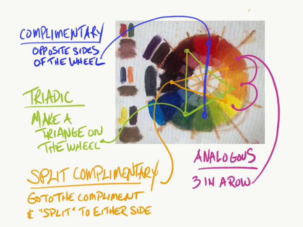
Below are a couple of popular harmonies we are going to play with.
- Complimentary harmonies are made by using colors that are directly apposite on the color wheel. Green and red, yellow and purple, blue and orange, etc.
- Triadic harmonies are three colors evenly spaced on the color wheel – red, yellow, and glue. Or purple, orange, and green.
- Spit complimentary harmonies are made by choosing a color, finding it’s compliment and moving one color in either direction on the wheel – blue, and yellow-orange, and orange-red. Or blue-purple with orange and yellow.
- Analogous harmonies are made by using three neighboring colors on the wheel.
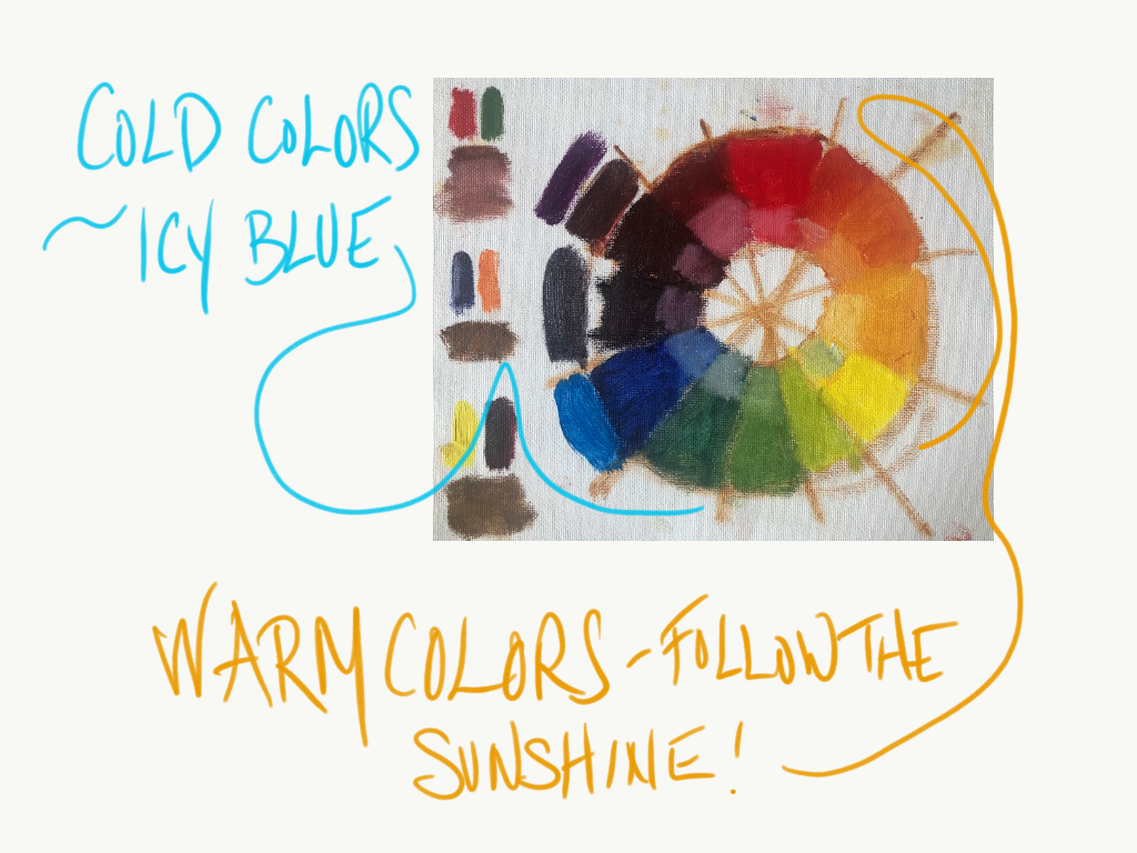
Warm and cool colors
I’m only going to touch on this briefly because it twisted my head in circles when I first tried to grasp it, but you will hear the term often if you are around other painters so let’s just dip our toes, and save the rest for a different class. Warm colors are the orange side of the wheel, cool colors are blue side of the wheel. But, you can have warm blues, and cool yellows based on what you add to the paint. If you have blue and you add a tick of red, you have created a warmer blue. If you have yellow and you add a tick of blue you have created a cooler (and darker) yellow. If you add white to anything it cools it down… oyvey!
As a general guideline, if the light on your subject is a warm light then you will paint those objects using warm versions of their local color, and you will paint their shadows using cool versions of their local color, and visa versa. So – warm light, cool shadows. Cool light, warm shadows. The study of color is fascinating, and it can go on for a lifetime, so for the sake of just keeping it ‘basic’ please see my sweet little sketch below.
From NOTAN, to value sketch, to color harmony. Come along.
I went to a boatyard down in Tuckerton, NJ knowing that there would be all kinds of great angels there. There is also something about the sound of a marina that I really like. Maybe it knowing that these little floating ‘homes’ could zip off on a whim, like my van but on water. I love the squawking seagulls, the clanking of the lines against the masts, the salty sailers and the whole vibe of it. I’m sure I will create some inspired paintings from this area, but today we are just playing with shapes and color harmony.
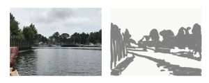
Take a note on the sketch below. I stood at the end of the doc. I felt the water on either side of me. I listened to the birds, and I let the warm sun sink into my skin for a few minutes. I could feel the environment surround me, and that is what the sketch represents. A photograph can never depict it in the same way because it can never BE in the environment. It can’t feel what you feel, and it will always fall flat comparatively. Surely, we work from reference photos. We take shots to remember a place and time, but don’t compose from the eye of a camera – compose from the eye of your soul, because it is far more broad and poetic than a camera will ever be. We will talk more about working from photos in the coming sections. For now, let your own eyes/hands do the composing. It will always be better.
Pick your harmony(s) and go for it!
I’m going to strive for just a few things here.
- No ‘noodling’ details. This is just about staying true to the NOTAN, the value sketch, and the harmony. The rest of it doesn’t matter right now.
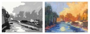
- I chose the split complimentary harmony with the blues as my predominant color. The yellow-orange and orange-red will play the supporting roles. Just as you want your values to be unequally divided (more masses of darks or more masses of light), you want your palette to be unequally divided. Choose your dominant color, and let the others support it.
- Generally when we want to lighten a color we strive to do it first by adding another color, and using white as a last (and necessary) resort. In this exercise we will be using white to lighten our colors first to make sure that the harmony is what you’re focused on.
- I’m bending my colors by adding very small ticks of the opposing color, and white. As you can see in the little clip below that you will come up with a pretty wide range of color.
- I use small inexpensive canvases for these exercises. The one below was painted on a 5′ x 7′ panel. You can also use one larger panel and divide it up into sections as you saw in the previous lecture. Paint a different color harmony of the same NOTAN in each section. Keep this panel in your studio area. You will refer to it again and again.
- And finally – in the video below on my palette… at one point I refer to my blue paint as yellow. Hahaha. That happens. I clearly meant ‘blue’. xo
Take that value sketch and add your color!
As I moved through this exercise I stopped to evaluate my harmony sketch and made some edits to improve the piece. The tree line on the right was too uniform so I made adjustments. The building clouds were too much of one solid mass so I added a bit more sky. I widened the deep dark water as it came forward on the canvas. Painting is a series of small adjustments. Make them with a light heart and you will have more fun.
A bit more refined. But not too much…
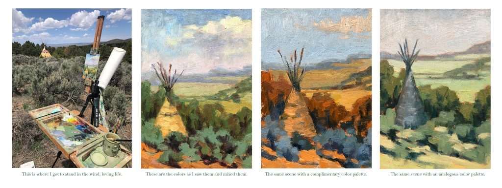
Taos, New Mexico is one of my favorite places. Perhaps it’s the edgy rawness of the landscape. It’s not manicured. It feels like the type of place where outlaws still hang out. It is also home to some fun friends and great painters, so I always enjoy the visit. Traveling to paint with friends is one of the best parts about painting. Start looking for plein air groups in your neighborhood, or talk a friend into taking this class with you. You will have a wonderful excuse to go ‘work’ out in the world with a completely new perspective.
I refined the paintings below just a bit more. These are all small – 5″ x 7″. You will progress much faster by creating more small paintings, rather than just a few large ones. You will also have more fun, and see more places. Keep your focus here on large shapes, value structure, and color harmony – skip the other details.