Didn’t I say this class would add more color to your life?! Hahaha… let’s go!
Making a color wheel may remind you of preschool, but you probably didn’t do it with oil paint. We will get more complex with color mixing in the next video, but this is where it begins. You will want to refer to this little gem that we are about to create together over and over. I had a color wheel taped to my easel for years and it really helped me cement in the color relationships and understand how colors compliment or neutralize each other. So whip it on up and keep it close.
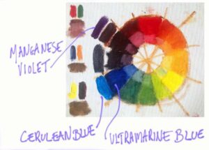
I added some Cerulean and Violet so you can see.
We used Ultramarine Blue to create the purple in our color wheel. It’s my go-to blue. I like that it is a transparent paint and it’s very versatile. I also keep a Cerulean Blue on my table which is closer to a true blue. I’ve added it to my color wheel below so you can see the difference. I’ve added Manganese Violet as well so you can compare. There are a slew of fun colors out there and you will surely want to experiment with them as you move forward, but it really is best to start with a limited palette and get comfortable with it first.