Taking a little break…
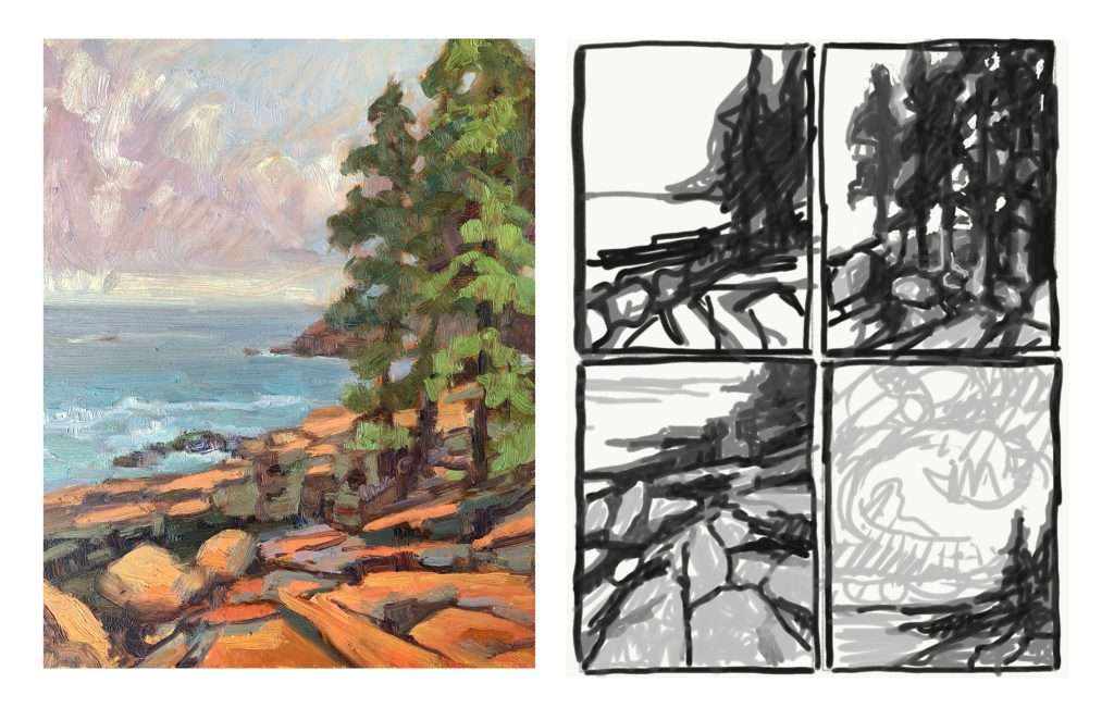
I got the last section of this workshop loaded up and then I went to Maine to paint for a week. We got up early and hoped to beat the rain. I chose my spot, popped up my easel and got right to work. I had my sketchbook but must have left my sharpie in the van so I skipped the part were I normally plan out my composition, choose my motif, and design the NOTAN. I just wanted to jump right into the painting and bang one out before it was too late. I got a little sketch done and then laughed at myself, realizing that I had just done exactly what I told you not to do in the previous lecture. It’s not a terrible painting, but had a chosen my motif, it would have been much more powerful. I followed the painting up with the sketches that I should have done first, and then painted another piece with a very specific motif.
In the illustration below you can see that the piece I ‘banged out’ basically has an equal spacing of foreground, background, and sky. There are rocks, and trees, and sky, all with an equal level of importance. I have not made any of the three main elements the star of the show – so it’s calm and peaceful, but not very powerful. The NOTANS to the right show you the one I painted, compared to what it could have been if I chose my motif. Is it about the tenacious trees that grow from the rocky hard landscape, or the bold colorful rocks that define the coastline, or the impressive thundering clouds that make you feel the enormity of the universe? I should have made a choice.
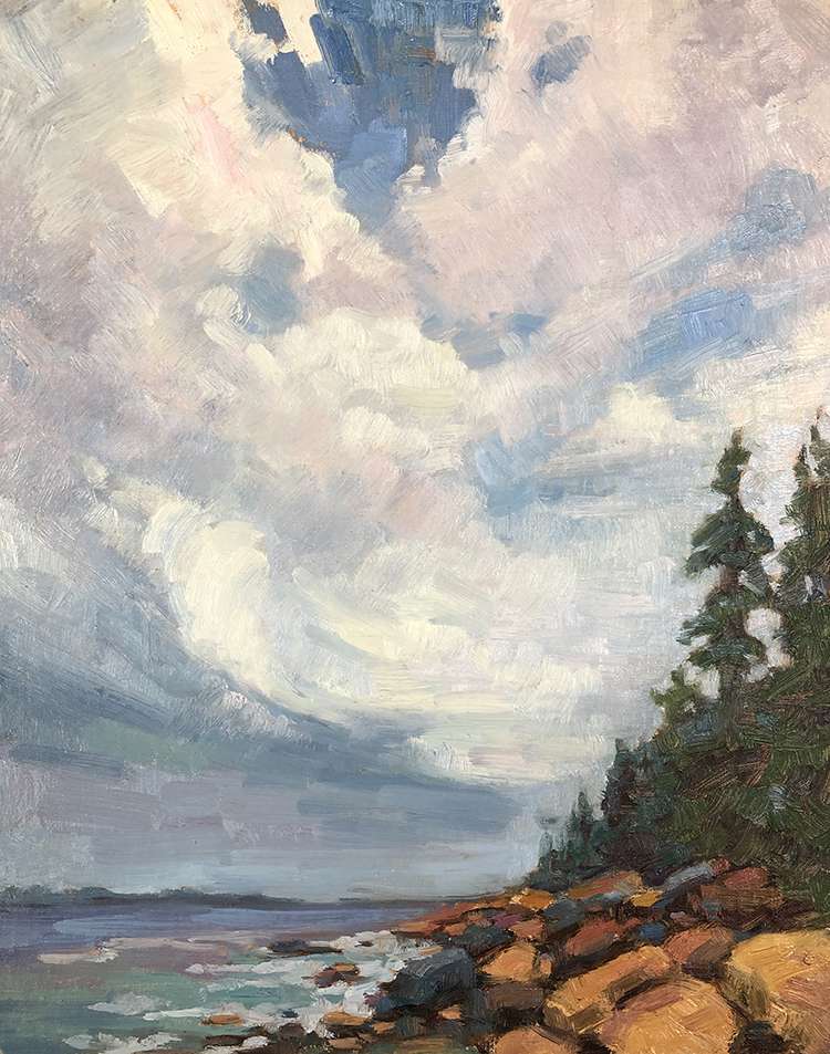
Later in the day I painted the same scene, but I chose to focus on the motif of the impressive building clouds. I like this painting MUCH better.